Sumido

挽肉の道 — Japanese Hikiniku Restaurant  ·  Food & Beverage  ·  v0.1  ·  Updated 2026-05-16

Moodboard

MoodboardMoodboardMoodboard

Brand Story

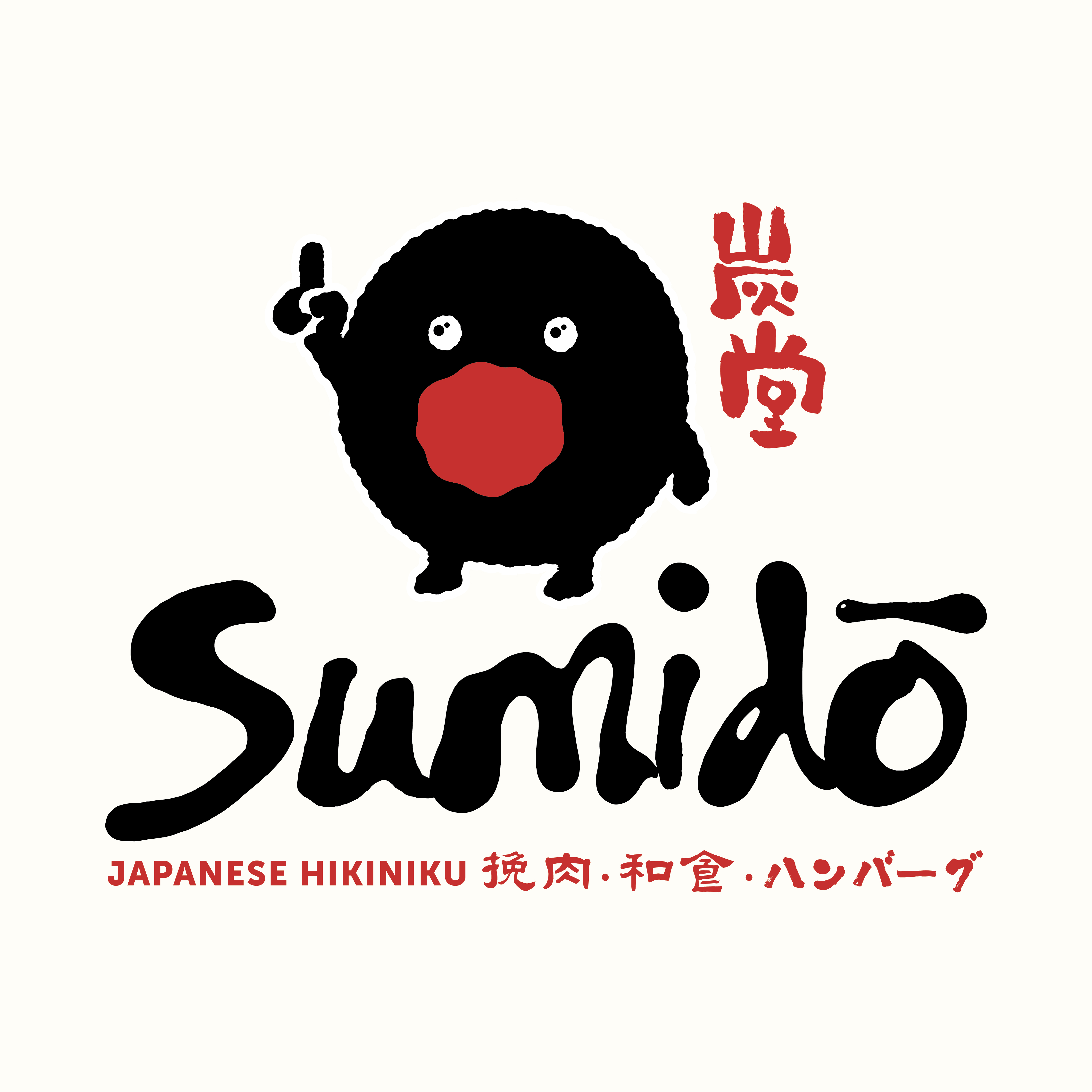
Sumido is a Japanese Hikiniku restaurant where every hamburg steak carries the discipline of Kyoto craftsmanship — unhurried, precise, and deeply satisfying. The name echoes 炭堂 (Sumi-dō), a hall of charcoal, evoking the smoky warmth of binchotan-fired kitchens and the intimate atmosphere of a Kyoto machiya side street. The brand mascot — a round, charcoal-black creature with a red maw and a raised finger — is not cute; it is confident, a little mysterious, and utterly serious about meat. Sumido exists for food lovers who understand that the best bite is one that took years to perfect.

Mission

To serve Japanese hikiniku hamburg with the quiet precision of Kyoto craftsmanship, making every guest feel the depth of flavour that comes from doing one thing, obsessively well.

Values

Colours

Primary

Ink Black
#1A1A1A — Primary brand colour; used for logo wordmark, mascot body, headlines, and heavy backgrounds
Charcoal Red
#C8221E — Accent and action colour; used for kanji stamp, sub-tagline type, CTAs, and highlight marks
Washi Cream
#F5D6AF — Background base; replicates the warm off-white of the logo field and traditional washi paper

Secondary

Binchotan Ash
#4A4A4A — Secondary text, captions, and UI dividers — softens pure black in body copy
Umami Brown
#6B3F2A — Warm earthen accent for food photography overlays and secondary graphic elements
Miso Gold
#C9973A — Subtle highlight for premium dish callouts, price tags, and seasonal menu badges

Typography

Logo Variants

Primary — Full Wordmark (on cream)
New variant
New variant

Voice & Tone

Language

Do say:

Don't say:

Social Accounts

Past Work

https://drive.google.com/drive/folders/1kmQKM7ZbJxSqGJnDi2mZO9LeUzmQqRDA?usp=sharing

Asset Library

https://drive.google.com/drive/folders/1cOhXBVt4RLcQfVmM4hv8ChaAkCPdTU2C?usp=sharing